
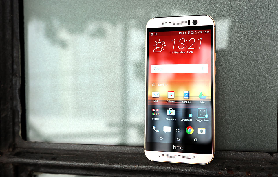
The first thing you will probably notice about the HTC One M9 is that it looks the same as the previous model. It’s probably because of the fact that HTC knows when they’re doing a great job and don’t wish to change the design too much. In short: If it’s not broke, don’t fix it.
But what exactly is new inside the HTC One M9 if the design looks the same, you might ask. Well, there are quite a few changes made to the new smartphone but not all of them are for the better.
Here is our HTC One M9 preview.
The build quality on the HTC One M9 is, as always, great. The new generation smartphone is a tiny bit narrower, fatter and shorter than the previous M8 model. The chassis of the new mobile phone is great. It’s very fast and we didn’t face any problems with the HTC smartphone, even though it uses the same Snapdragon 810 chip found in LG’s G Flex2 (but to be fair, we haven’t encountered any serious issues with LG’s mobile phone, either). The device performs really well, mostly because it has 3GB of RAM which made browsing the web and switching between apps a walk in the park.
An annoyance regarding its design is the metal lip running around the phone’s edge. This was put there by HTC to help you get a better grip of the device. It’s nice that HTC actually listened to the feedback from its customers but the metal lip can feel awkward at times, especially when it sticks into your palm. Small design touches like this one seem very strange and foreign when you’re used to the more comfortable HTC One M8.
These little touches are what the philosophy of the One M9 design is. The company tried to make a more premium smartphone but the M8 was such a good phone that it didn’t need any serious changes. HTC moved the power button under the right edge of the M9 and the volume rocker was split into two buttons. A MicroSD slot can still be found above. The company also made one of the speaker grilles smaller in order to make room for the somewhat bigger front facing camera.
HTC felt there wasn’t much to change in terms of design and we mostly agree with its decision to keep things clean and familiar.
However, there are some changes that we don’t really agree with. One of these changes is the 20MP camera on the back of the M9. The company decided to move the UltraPixel technology on the front facing camera and use a 20MP Sony sensor on the back. Our early tests have shown that the new camera seems a bit worse than the camera found on the previous generation. Color temperature and white balance seem inferior right out of the box. Photos taken with the M8 were a lot better than the ones we took with the new M9. Using the M9 in good lighting conditions proved to work a lot better and we hope that future software updates will fix all the issues with the camera.
Speaking of software, HTC made a lot of changes to the Sense Seven UI. We’ve always enjoyed the Sense user interfaces but it looks like they’re losing momentum seeing how several other phone manufacturers are making their own UIs. The new UI seems to go on uncharted territories for the company but the changes are actually some of the best we’ve seen from HTC.
BlinkFeed is still present and it’s still filled with news from your preferred sources but now it will also analyze your past preferences and location to give you more accurate suggestions. Also, the apps you download go inside a folder called Downloads rather than on your home screen. This is truly a nice touch, seeing how the home screen can get a little messy.
HTC One M9 Customization Features
What’s more important is that now you can customize the themes on your phone. You can customize pretty much everything from the icon sets to the launcher to the wallpaper in order to meet your desires.
HTC offers some themes to choose from directly out of the box but the company wants us to start sharing, making and even selling our own themes to others. When I first heard of this I wasn’t exactly sure how to react, seeing how in the past we saw how tweaking with the design can turn a standard look into an unrecognizable mess. If you don’t know what I’m talking about, just think about MySpace.
But this isn’t the case. If you scramble around tiny parts from the official themes you end up with something that looks pretty bad but not entirely horrible. The best results we’ve had were when we loaded an existing theme and swapped only small things around, such as the icon sets and the keyboard.
The Sense Home widget raises the most important question mark for now. This is a widget that allows you to quickly access the apps it thinks you’re going to need, depending on where you currently are: Out, Work or Home.
There is a folder called Suggestions that highlights apps you may find useful, based on your history of usage. However, HTC didn’t make it clear if it’s going to partner with third parties to offer you suggestions that have been sponsored. If this is the case, the widget may prove to be somewhat useless.
We don’t want to get into too much detail, seeing how we only tested the device for a small period of time and we’ll have to wait until we get our hands on a review unit to make a full HTC One M9 review. Nevertheless, it looks like HTC clearly went for polish instead of progress in this year’s generation of HTC One.
This seems only fair, seeing how we can’t expect companies to completely redesign everything from scratch year after year. The HTC One M9 is a really good smartphone but it’s not all that impressive. I guess only time will tell if these small improvements/differences will mean something to those considering purchasing one.
Image source: 1


