I’m not talking about colorful, candy-like looking applications, but actually a very professional Twitter app that was designed to incorporate the Material Design that came with the latest Android 5.0 Lollipop operating system.
People who have heard of Falcon Pro before will know that it is, with little to no discussion, the best Twitter application out there.
How Was Falcon Pro 3 Received by the Public?
While there were some complaints and features that did not appeal to the public so much on previous version, the Falcon Pro 3 brings a complete redesign and concept behind it that will appeal to all the Android 5.0 fans out there. The application is available in the Google Play Store as we speak, ready for the taking for only $3.99.
Even though it’s a bit of a letdown for Falcon Pro 2 users, having to pay again for the application and not getting the update for free, we can assure you the latest version is well worth the cash you’ll invest in it.
So in case you’re not accustomed to this kind of applications, perhaps you’re wondering how they work. If such applications are allowed, and considerably superior to the basic one released by Twitter in the first place, why wouldn’t everyone simply switch to the better, prettier alternative? Well, Twitter Tokens, that’s why.
Twitter only allows each third party developed app a limited amount of users – tokens; when the amount is reached, the app in question becomes unavailable to other users trying to download it in order to access Twitter. This fact lured many developers away from making Twitter apps or improving the ones existent, completely giving up on their projects.
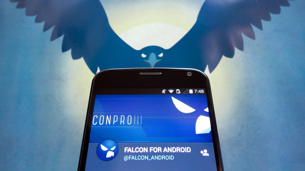
Developer Joaquim Verges however – the man behind the Falcon Pro series – has managed to find a way around the token limit and has consistently been working to improve the app in all ways possible. The latest installment of the Falcon Pro series looks incredibly refreshing and elegant – given the adopted Material Design.
The Falcon Pro 3 is an application that was developed by rethinking the concept of the series and redesigning the whole thing from scratch. It’s not a full featured Twitter client yet, but can still do 99% of the things you’d wish for it to do. Sure, it may lack here or there, but taking into consideration the amount of effort Verges has constantly put into the Falcon Pro, improvements are surely on their way.
Come to think of it, by the way things are looking you could call the current version pretty much a beta – while it will provide you smooth Twitter navigation to your heart’s content, it’s still lacking some very basic features.
Falcon Pro 3 Design & Features
Similarly to how Falcon Pro 2 felt simply natural to the Android platforms, often winning against other third party developed Twitter apps such as Fenix, Tweetings or Talon, Falcon Pro 3 does it again – and does it in more ways than just visual – thanks to the adoption of the Material Design.
But the Falcon Pro 3 isn’t just making use of Material Design skin – all of the animations and design displayed by the app have obviously had a lot of time and effort put in them by the developer. The app looks and feels great, from one end to the other. Transitions are made smoothly from window to window, the Falcon Pro bringing your tweets and columns into focus beautifully, making navigation a real Material Design treat.
The very first thing that you will notice about the Falcon Pro 3 is the way it makes use of columns to allow you to navigate through its menus and features. It doesn’t even force a certain pattern on its user either, allowing you to set up the format just the way you want to.
The app starts off with no columns, giving you the freedom to choose what columns and in which order you wish for them to be settled, and allowing you the freedom to add as many columns to swipe through as you want. Right now, you can only choose form a limited list of column types – timeline, mentions, favorites, lists, search and users. Upon selecting your first column, you can arrange the rest by swiping either left or right to set up your preferred arrangement.
There is a generally large amount of resentment towards the way the search column works because the way it’s currently functioning will definitely earn itself a change sometime soon: instead of allowing you to have one dedicated search column, the app prompts you to open a new search column every time you want to look for something, limiting your searches and displaying results to only one query per column.
Many people will rejoice at the fact that Falcon Pro 3 supports multiple user accounts, allowing you not only to keep an eye on all of your accounts at the same time, but also gives you multi account tweeting capability.
It might be a little disappointing on the pricing side as multiple account usage will draw upon you an extra $1.99 per account you wish to enable, and that is on top of the basic app price. You can view and switch between accounts you are currently signed into by swiping from the left edge of your screen, also giving you an overview of your Followers (entitled Friends), mentions, favorites and retweets.
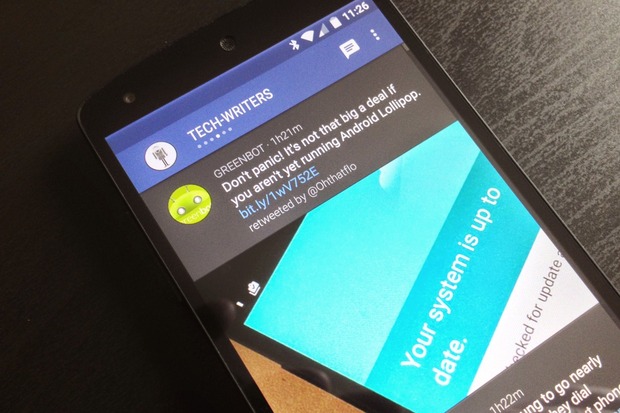
Notifications have not been forgotten and will be bundled up together nicely in the notification inbox – allowing you to freely scroll through them vertically, and swap from one account to the other’s inbox by swiping horizontally. Other nifty features have made it into the Falcon Pro 3 just as well – the URL shortening to prevent problems with your Tweet character limit, big in-line images and many more.
There are, however, a few things the Falcon Pro 3 is currently missing: there’s no direct message option, and sadly no settings menu to give you the freedom of customization – there’s little to nothing you can do about notifications and the way they appear, and if by any chance you’re no big fan of the look the app displays, you will be stuck with it for a while apparently as it has been announced that those will be implemented in a future release.
A very neat addition to the way the Falcon Pro 3 works is its focus on battery usage. Verges seems to have put a little more thought into an algorithm that will automatically adjust the amount and frequency of notifications you receive based on your own activity on the app.
If Falcon notices your usage is minimal, it will not insist on pushing notifications every time you receive one, instead reducing their frequency a considerable amount, sending them in rare batches. If your activity on Twitter is plentiful however, the notifications will start being sent in faster. Certainly, the app allows you to change this and turn the feature off in case you prefer to receive your notifications on the dot, as soon as they appear.